
I want to illustrate LC-MS data in 3D to illustrate patterns of isotopes, adducts and molecular structures. I want my students to be able to present these as figure in their dissertations and theses and ultimately manuscripts. I’ve managed this using the Plotly library for Python. Here’s an example from my MSc students’ LC-MS analysis of sterol glucosides in lecithin:
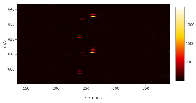
The three ions at the top are acetic adducts of the three common plant sterol glucosides, whereas the three at the bottom are chlorine adducts of the same molecules. You can see they coelute and their m/z delta is 24. This is just an image, I haven’t worked out how to post interactive Plotly figures yet.
Here’s the code:
# This python script strips the time, m/z and intensity values from an LC-MS.txt file
# and plots it as a heatmap using the plotly library# Copyright (C) 2018 Chris Pook
#This program is free software: you can redistribute it and/or modify
#it under the terms of the GNU General Public License as published by
#the Free Software Foundation, either version 3 of the License, or
#(at your option) any later version.#This program is distributed in the hope that it will be useful,
#but WITHOUT ANY WARRANTY; without even the implied warranty of
#MERCHANTABILITY or FITNESS FOR A PARTICULAR PURPOSE. See the
#GNU General Public License for more details.#You should have received a copy of the GNU General Public License
#along with this program. If not, see <http://www.gnu.org/licenses/>.
# Start from a full scan (MS2 scan) mass spectrometry file in your native format
# convert this to an MS.txt file using msconvert (select text output)
# You can get msconvert from the Proteowizard package# DON’T FORGET TO SET THE SCALING FACTOR
# numbers <1 flatten the data (less contrast)
# numbers >1 increase contrast
factor = 1import glob, os
from Tkinter import Tk
from tkFileDialog import askopenfilename
import pandas as pd
import plotly.plotly as py
import plotly.graph_objs as go
import plotly.offline as offline# get a MS txt file
Tk().withdraw() # we don’t want full GUI, so keep the root window from appearing
f = askopenfilename(filetypes=[(‘MS txt file’, ‘.txt’)],
title=’select one MS txt file’) # show an “Open” dialog box and return the path to the selected file
Folder = os.path.dirname(f) # strip out the folder path
aa = f.split(‘.’)
output = aa[0] + “_STACKED.csv”# open the file and read it line-by-line
fOpen = open(f, “r”)
lines = fOpen.readlines()# some variables
# the three arrays will end up holding lists of those values
# each triplet of values codes for one point on the heatmap
a = 0
secs = []
mz = []
signal = []
s = 0
m = 0
sig = 0# now, let’s hack that data out!
for n in lines:
if ” cvParam: scan start time, ” in n:
# split off the text at the start of the row
b = n.split(‘,’)
#strip out whitespace
c = b[1].strip()
# convert to a float
s = float(c)
#print s
if ” binary: [” in n:
# split off the text at the start of the row
d = n.split(‘]’)
# strip the whitespace around the data
e = d[1].strip()
#turn it into a list of floats
f = [float(i) for i in e.split()]
#print f[0]
if a < 1:
m = f
a = 1
#print m[0]
#print m[1]
else:
#print f
sig = f
#print sig[0]
#print sig[1]
for g in range(0, len(m)-1):
#print g
#print s
secs.append(s)
#print len(secs)
#print m[0]
mz.append(m[g])
#print sig[0]
signal.append(sig[g])
a = 0# a little debugging output
print len(secs)
print len(mz)
print len(signal)# stick all that lovely data into a pandas dataframe
MS = [(‘seconds’,secs),
(‘m/z’, mz),
(‘signal’,signal),
]
df = pd.DataFrame.from_items(MS)# more debugging output
print df.head()# layout details you can change
# either uncomment autosize or specify your own height & width
layout = go.Layout(
width = 800,
height = 600,
#autosize = True,
#showlegend = False,
xaxis=dict(
title=’seconds’),
yaxis=dict(
title=’m/z’)
)# it’s heatmap time!
# plotly colourscales – take your pick!
#Blackbody,Bluered,Blues,Earth,Electric,Greens,Greys,Hot,Jet,Picnic
#Portland,Rainbow,RdBu,Reds,Viridis,YlGnBu,YlOrRdtrace = go.Heatmap(x = df[‘seconds’], y = df[‘m/z’], z = pow(df[‘signal’], factor), colorscale= “Hot”)
data=[trace]fig = go.Figure(data=data, layout=layout)
offline.plot(fig, filename=’my_awesome_LC-MS_heatmap.html’)

