A Media Complaint About Puberty Blockers and Suicide

In March 2026, the New Zealand Herald published an article about the Government’s ban on new puberty blocker prescriptions for gender-dysphoric young people. The article was sympathetic in tone and drew on a personal account from a guardian who had raised a young person on puberty blockers. That is a legitimate form of journalism. What followed, however, is the subject of this post.

I lodged a formal complaint with the New Zealand Media Council on two main grounds: that the article stated as plain fact a claim about puberty blockers that is not supported by the evidence, and that it published a statement about suicide that breaches New Zealand’s own national guidelines on responsible reporting. The documents relating to this process are linked below.


The Reversibility Claim

The original article contained the sentence: “Puberty blockers are reversible.” This was presented without attribution, qualification, or any indication that it was contested. It is not an accurate statement of the current evidence.

The 2024 Cass Review was an independent review commissioned by NHS England and cited in the very same article as the basis for the Government’s ban. The review, led by Baroness Dr Hilary Cass, found that reversibility is undemonstrated across multiple domains. On bone health, it found that bone density is compromised during puberty suppression and that much longer-term follow-up is needed to determine whether full recovery occurs in adulthood. On brain development, it found that brain maturation may be temporarily or permanently disrupted. On fertility, the 2025 US Department of Health and Human Services review found that where puberty blockers are followed by cross-sex hormones, as occurs in more than 90% of cases, there is no proven physiological mechanism by which fertility can be reliably re-established.

Both reviews concluded that the “pause button” description of puberty blockers- the idea that the treatment simply puts puberty on hold with no lasting consequences- is not supported by research. It is an assumption that was embedded in clinical guidelines without being adequately tested.

After I complained, the Herald amended the article to read: “Puberty blockers have long been thought of as fully reversible, although this was disputed by the Cass Review, which said the claim that there were no lasting negative effects was lacking evidence.” This is an improvement, but it still understates the position. The Cass Review did not merely dispute a long-standing consensus. It found that the claim was never adequately evidenced in the first place. And characterising its findings as saying that evidence for safety was “lacking” is weaker than what the Review actually found: positive evidence of harm in several domains.

The Suicidality Claim

The more serious concern involves a statement made in the article by Professor Paul Hofman, a paediatric endocrinologist at the University of Auckland. Speaking in the context of what happens to gender-dysphoric young people who do not receive puberty blockers, Professor Hofman is quoted as saying that some “self-harm” and “others become suicidal.”

This statement was published without challenge and without any reference to the evidence base. The problem is not only that the claim is not supported by the current evidence. The Cass Review concluded that “the evidence does not adequately support the claim that gender-affirming treatment reduces suicide risk”. But also that the manner in which it was published breaches New Zealand’s own guidelines on responsible reporting of suicide.

Those guidelines, which are embedded in the Government’s Suicide Prevention Action Plan 2025–2029, require that claims about suicide are evidence-based, that suicide is not attributed to a single cause, and that reporting avoids creating the impression that suicide is the expected or likely outcome in certain situations. The statement as published fails all three of these tests. It attributes suicidality to a single cause: the absence of a specific treatment, and creates the clear impression that suicide is an expected outcome for young people who do not receive that treatment.

The risks of this kind of reporting are well documented. A 2024 review commissioned by the UK Government specifically examined claims about suicidality made in public discourse about puberty blockers and found that attributing suicide to a single cause in this context was “insensitive, distressing and dangerous.” It identified the particular risk to already-distressed young people of identifying with the message that people in their situation are expected to die without a specific treatment, a dynamic that research has shown can lead to imitative harm.

The Media Council Process

The Media Council upheld the complaint in part. It accepted that the original reversibility statement was inaccurate and that the Herald’s amendment, while an improvement, did not fully resolve the concern. It did not, however, uphold the complaint on the suicidality ground, finding that the article did not “expressly assert” a causal relationship between the absence of puberty blockers and suicidality.

I have written to the Council to seek clarification on this finding. The Council’s ruling at paragraph 14 explicitly noted my reference to the Suicide Prevention Action Plan, but its reasoning on the suicidality ground made no mention of the responsible reporting framework or the evidence I submitted. My question to the Council is simple: were those materials considered, and if so, how were they weighed?

The reason I think this matters beyond the specifics of this article is that the responsible reporting guidelines exist for a reason. They are grounded in research showing that the way suicide is reported in the media affects the behaviour of vulnerable people, particularly young people. If those guidelines apply in all other contexts- and they absolutely do- they must also apply when the subject is gender dysphoria. The content of a claim does not change the reporting standards that govern how it is published.

The Documents

The following documents relating to this complaint are available below. I have not included the personal correspondence or the supporting scientific materials in this post, but I am happy to share them on request.

My original complaint to the NZ Herald and, subsequently, the Media Council:

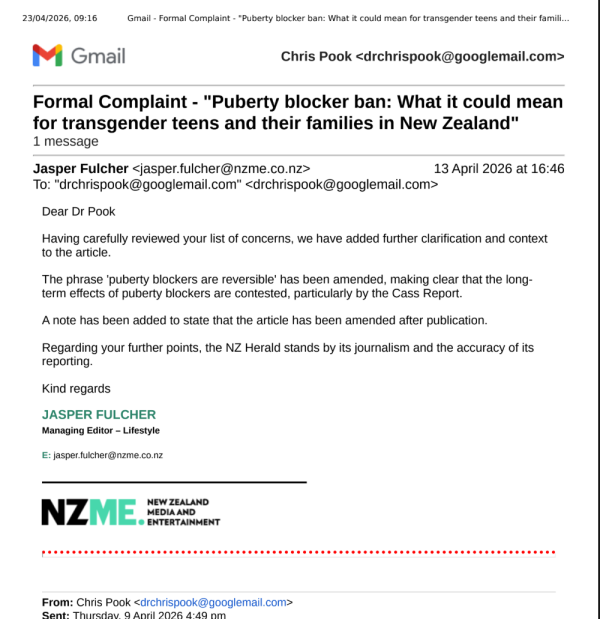
The Herald’s initial response to my complaint:

The Herald’s formal response to the Media Council

My response to the Herald’s submission:

The Media Council’s ruling:

My request to the Media Council for clarification:

parsing MS-DIAL alignment exports to pandas df

If you wish to access the data from your MS-DIAL analysis programmatically for post-processing, then you face the non-trivial challenge of parsing the output to a dataframe. This is made challenging because the format of the alignment exports is not a simple xy matrix, but contains two data frames nested within each other, one for the qualitative information and the other for the quant. Consequently the headers for the qualitative data frame begin on row 5, as can be seen in this screenshot.

The qualitative data consists of 32 columns, beginning with Alignment ID, Average Rt(min), Average Mz, and Metabolite name and finishing with MS/MS spectrum. That last column is the point where things get interesting because the four rows above it in that 32nd column contain the headers for a separate table, aligned horizontally instead of vertically.

I have shaded and outlined the different columns for clarity. The blue table has headers in the left hand column (AF). The data includes class, file type, injection order and batch. This is essential data for creating quantitative plots, doing manual post-processing, such as blank subtraction or normalisation, and for many other downstream operations. You could enter this data into your processing as a separate input, but it is desirable to be able to scrape this data from a single input.

I have written a short python script in Jupyter Notebook to separate the qualitative data and the quantitative data from this single file and to scrape this important metadata and provide access to it as list objects. Please try it out and let me know if it useful.

Why I object to the term “ultrahigh resolution mass spectrometry”.

I use our QExactive for untargeted metabolomics in the range m/z 80~1500. Typically with resolution set to the minimum value of 17,500, because the ability to scan quickly is more important than the ability to resolve m/z. The resolution on the Agilent QTOF in the Cancer Research lab is comparable, at ~20,000. I only mention this because it is another “high resolution MS” platform, as I understand the term. I consider these instruments worthy of the “high resolution” qualifier in HRMS because the other instruments I use are all “unit” mass spectrometers that differ in resolution to the QExactive and QTOF, as typically used, by factors in the tens of thousands.

However, as I’m sure you know, the QExactive can go up to resolutions of 140,000. Well, ours can. Newer models may be even more awesome. But the scan speed scales proportionally to the resolution. Consequently, I can’t use that high resolution when I analyse complex biological samples due to the large number of features in the data, the width of the peaks, the need to maintain throughput, & the need to collect multiple MS/MS scans in between full scans.

I recently tweeted a question asking whether the term “ultrahigh resolution mass spectrometers” was useful, when applied to the QExactive, in reference to a paper in ES&T: An Automated Methodology for Non-targeted Compositional Analysis of Small Molecules in High Complexity Environmental Matrices Using Coupled Ultra Performance Liquid Chromatography Orbitrap Mass Spectrometry. I can’t find the resolution used in the LC-MS method in the paper. However, if I assume it was the maximum resolution available on our own instrument that is still only 8 times higher than the value I routinely use and refer to as “high resolution” mass spec.

The seven Tesla Bruker Solarix at the UoA School of Biological Sciences apparently has a maximum resolution of 10 million. That is 71 times higher than the maximum on my QExactive and 571 times higher than the resolution I typically use it at. No one here typically refers to that as “ultrahigh” resolution mass spectrometry. It’s just mass spec. I’m not even sure what you’d use that resolution for, or whether it’s achievable in routine analysis. I think it’s something that protein chemists use to resolve things like post-translational modifications.

The division of analytical techniques into ‘good’, ‘better’ and ‘best’ evolves every day. As an example, a few years ago I was lucky enough to attend a seminar by Peter Derrick where he presented the results of the multi-turn TOF mass spec he had been working on for several years. When the instrument was first reported in 2005 the authors reported resolutions of 350,000 and termed this “very high resolution mass spec”. That resolution is now achieved every day by commercial Orbitrap instruments.

The prefix ‘ultra-‘ indicates extreme or transcendental status of the suffix. If the division between unit resolution and HRMS is in the tens of thousands, I do not think an increase of eight times above that worthy of that prefix. In fact, I reject the need to brand every modest increment in technical capability with an inappropriate adjective. Science evolves and technology that was once cutting edge becomes pedestrian and then obsolete. Science is also beset with jargon. The continuous addition of superlatives to describe the incremental progress in technology is unhelpful to students, who get lost in the (often abused) terminology. It is an impediment to efficient communication of methods between scientists and even more so to the lay public.

Don’t get me started on LC/HPLC/UPLC/UHPLC.

convert NIST mainlib and replib EI libraries to .msp format to annotate GC-MS data with MS-DIAL

In my previous post I described how to convert NIST LC-MS/MS libraries to .msp format using the lib2nist program. This procedure will not work for the mainlib and replib EI libraries. For some reason these are encoded differently and will not appear in lib2nist as source libraries for conversion. The only way I have found to convert these is to use the Agilent version of the NIST library, which comes with the library in two different formats: the NIST format, which you can’t convert, and a .L format file used by Agilent’s MassHunter software suite. This latter file appears to contain all of the spectra from mainlib and replib, as well as some Kovats Retention Index data (of which more later).

To convert this .L format library using lib2nist you just have to select the file as the conversion source.

Selecting the Agilent .L file as conversion source.

Once you have selected the source file to export from you need to select a subset fo the data to export as lib2nist will not export the whole thing in one go. I can’t remember how many files you should select but I think it has to be blocks of about 50K. There are nearly 400K spectra in NIST2020 so that’s eight subfiles you need to export and then combine.

Selecting the subset to export. Use the ID numbers in the NIST library and select sequential blocks of eg. 1-50,000, and then 50,001-100,00, etc.

Once you have exported the separate files you will need to use a large text file editor, such as Vim, to combine them into one file. Then you should be able to select that file in MS-DIAL to get identities for all of your features.

Thanks to Raquel Cumeras (Twitter @rcumeras) for reminding me how to do this.

Addition:

I have confirmed that lib2nist cannot export more than 64K spectra at a time when working on EI libraries. I tried exporting 250K, which works when you export the LC-MS/MS libraries. Here’s the error it threw:

converting NIST LC-MS/MS libraries for use with MS-DIAL

NIST format libraries contain a lot of valuable information that would be even more useful if it could be accessed by other mass spectrometry software, such as MS-DIAL and AMDIS. I have been told that the NIST MS Search Program has an API which allows you to pass spectra to it and obtain results programmatically. This is evident in proprietary software, such as Agilent MassHunter and Thermo Freestyle. I understand you can email the NIST people and they will send you details of the API. However, open source software, such as MS-DIAL don’t seem to have implemented that capability. Therefore it is necessary to use other solutions to convert the information encoded in the NIST library into a format accessible by other software.

Public mass spectral libraries are typically encoded in several open formats, such as .mgf, .msp and .mzML formats. These formats are typically encoded as text and so are readily accessible. MS-DIAL uses .msp format libraries, for example. A description of the .msp text format can be found in this pdf (page 47). The lib2nist program included with the NIST library will allow you to convert the NIST library and similarly encoded data, such as the Wiley Registry, into these accessible formats. I have done this with both EI and HRMSMS libraries from NIST. Using lib2nist you can export each library to a series of .msp text files. You can’t export the whole library in one go so you have to limit the export to a certain number of records at a time. I found that 250K works. Once you’ve exported all your spectra from NIST you can recombine the files using a large text file editor, such as Vim. If you export the NIST high resolution MS/MS library the .msp file is nearly 3GB so there’s quite a bit of text.

Selecting a library to export in lib2nist. Note that you need to specify the MSSearch directory path first.
Defining the subset of spectra to export. You can’t export the whole library in one go so you need to create several files and recombine them afterwards.

The MS-DIAL team provide their own spectral libraries in .msp format incorporating all the available public libraries, such as those from mass spectral repositories, MassBank and GNPS, as well as several libraries kindly shared by individual research groups. If you open these .msp in a text editor and inspect the content you can see that the keys for the fields in the MS-DIAL libraries vary from those exported by lib2nist. The table below shows how they differ.

NISTMS-DIALnotes
NameNAME
Notes
Precursor_typePRECURSORTYPEadduct
Spectrum_typeMS1/MS2
PrecursorMZPRECURSORMZ
Instrument_type
Instrument
Sample_inlet
Ionization
In-source_voltage
Collision_gas
Collision_energyCOLLISIONENERGY
Ion_modeIONMODEpolarity
InChIKeyINCHIKEY
Synon
FormulaFORMULA
MW
ExactMass
CASNO
NISTNO
ID
SMILES
CCS
Ontologymolecule class
RETENTIONTIME
CommentComment
Num peaksNum Peaks

Firstly, there’s a lot more fields in the NIST library export than the MS-DIAL library .msp file. Secondly, the fields are in lower case, with capitalised first letters and words separated by underscores. The exceptions are PrecursorMZ and Num peaks, neither of which get an underscore. There’s no obvious reason why.

The MS-DIAL fields aren’t consistent either, with a mixture of capitalised field names without spaces or underscores separating words, and words in lower case, with Num peaks matching the NIST format. The MS-DIAL documentation claims that case of the field text doesn’t matter. I’m guessing the underscores do as when I try importing the .msp exported by lib2nist I get no annotations in MS-DIAL. I wrote a Python script to substitute the MS-DIAL format keys for those in the lib2nist export. However, this didn’t work either. I then stripped out all of the fields from the NIST export that weren’t present in the MS-DIAL library. This did work and I got annotations from MS-DIAL!

For the final icing on this cake you can combine the MS-DIAL .msp library with your NIST export to get annotations from both.

NB

This procedure will not work for the NIST mainlib and replib EI libraries. See the follow-up post for instructions on how to convert them.

atmospheric carbon dioxide sensing with an Arduino

I was asked by my Lab Manager to investigate whether one of our CO2 incubators was working properly. Apparently there’s some doubt as to whether it was maintaining CO2 levels. CO2 is an easy gas to detect for the same reason that it causes global warming: it absorbs infrared radiation. You can now buy cheap Non-Dispersive InfraRed CO2 detectors for about US$40 from websites such as AliExpress. However, CO2 incubators typically enrich CO2 to about 5% by volume while most of the cheap sensors only measure up to around 0.5%, or 5,000 parts per million [ppm]. I found a sensor from Sandbox Electronics that works up to 10% by volume, or 100,000ppm. Perfect for testing CO2 incubators.

The MH-Z16 NDIR CO2 Sensor costs $67.95 and comes with a UART to I2C adapter. This makes powering it and communicating with it quite simple: just connect four wires to the development board of your choice! I used an Arduino Nano to read the values from the sensor and send them to the laptop over the USB connection that was also powering it. The sensor can be calibrated in atmospheric CO2 conditions at the push of a button. I have reservations about this one-point calibration but “you pays yer money…”, as my dad used to say.

The Nano is sitting on a screw terminal shield with mount holes for easy connections ($4 well spent for making secure, non-permanent connections to the Arduino). On the laptop screen you can see data coming in from the example sketch I copied from the vendor’s website and using the Arduino library they provided. The sketch sends a reading every second. The serial output shows a starting CO2 reading of 458ppm which climbs slowly to >1000ppm when the photo was taken. This is because I was sitting in front of the sensor taking the photos and it’s registering a local CO2 increase as a result of my breath. If I huffed on it it climbed to >10,000ppm, or 1% by volume. The sensor is very slow to adjust to changes. I had to huff on it for a good couple of minutes until it got that high. Wikipedia tells me that exhaled breath is normally 4-5% CO2 so I guess if I’d kept at it for a while it would have got up there. I might have passed out before then though! 😆 When I moved it away from me it took several more minutes to come back down to ambient levels. Not ideal but fine for my application and budget!

The next task was to make an enclosure to protect the sensor, logic boards and delicate wiring. A couple of evenings spent playing with OpenSCAD yielded an alpha version which I cut on the lasercutter today and tried out. I had to correct a few mistakes in the design but ultimately produced this:

Which became reality as this:

I would have taken a picture of the two boards mounted inside but the lasercut bits fitted together so snugly I didn’t want to try and separate them again in case something broke. You can see the lights of the Arduino inside through the ventilation holes  🙂

I’ve put the sensor in an (allegedly) working CO2 incubator and left it for 20 minutes to stabilise. The sensor read about 40,000ppm, or 4% by volume. As the incubator was meant to be maintaining 5% I’m not too sure what to make of this. I will have to find another incubator to make a replicate measurement. Maybe all of our incubators are a bit off! 😵 However, I’m very pleased with how simple the sensor was to get working and seeing as all you need to run it is a laptop with the Arduino drivers loaded and a serial terminal, such as PuTTY, it is very accessible to even the relatively non-technically minded. 😎

plotting LC-MS data using Python and Plotly

I want to illustrate LC-MS data in 3D to illustrate patterns of isotopes, adducts and molecular structures. I want my students to be able to present these as figure in their dissertations and theses and ultimately manuscripts. I’ve managed this using the Plotly library for Python. Here’s an example from my MSc students’ LC-MS analysis of sterol glucosides in lecithin:

The three ions at the top are acetic adducts of the three common plant sterol glucosides, whereas the three at the bottom are chlorine adducts of the same molecules. You can see they coelute and their m/z delta is 24. This is just an image, I haven’t worked out how to post interactive Plotly figures yet.

Here’s the code:

# This python script strips the time, m/z and intensity values from an LC-MS.txt file
# and plots it as a heatmap using the plotly library

# Copyright (C) 2018 Chris Pook

#This program is free software: you can redistribute it and/or modify
#it under the terms of the GNU General Public License as published by
#the Free Software Foundation, either version 3 of the License, or
#(at your option) any later version.

#This program is distributed in the hope that it will be useful,
#but WITHOUT ANY WARRANTY; without even the implied warranty of
#MERCHANTABILITY or FITNESS FOR A PARTICULAR PURPOSE. See the
#GNU General Public License for more details.

#You should have received a copy of the GNU General Public License
#along with this program. If not, see <http://www.gnu.org/licenses/&gt;.


# Start from a full scan (MS2 scan) mass spectrometry file in your native format
# convert this to an MS.txt file using msconvert (select text output)
# You can get msconvert from the Proteowizard package

# DON’T FORGET TO SET THE SCALING FACTOR
# numbers <1 flatten the data (less contrast)
# numbers >1 increase contrast
factor = 1

import glob, os
from Tkinter import Tk
from tkFileDialog import askopenfilename
import pandas as pd
import plotly.plotly as py
import plotly.graph_objs as go
import plotly.offline as offline

# get a MS txt file
Tk().withdraw() # we don’t want full GUI, so keep the root window from appearing
f = askopenfilename(filetypes=[(‘MS txt file’, ‘.txt’)],
title=’select one MS txt file’) # show an “Open” dialog box and return the path to the selected file
Folder = os.path.dirname(f) # strip out the folder path
aa = f.split(‘.’)
output = aa[0] + “_STACKED.csv”

# open the file and read it line-by-line
fOpen = open(f, “r”)
lines = fOpen.readlines()

# some variables
# the three arrays will end up holding lists of those values
# each triplet of values codes for one point on the heatmap
a = 0
secs = []
mz = []
signal = []
s = 0
m = 0
sig = 0

# now, let’s hack that data out!
for n in lines:
if ” cvParam: scan start time, ” in n:
# split off the text at the start of the row
b = n.split(‘,’)
#strip out whitespace
c = b[1].strip()
# convert to a float
s = float(c)
#print s
if ” binary: [” in n:
# split off the text at the start of the row
d = n.split(‘]’)
# strip the whitespace around the data
e = d[1].strip()
#turn it into a list of floats
f = [float(i) for i in e.split()]
#print f[0]
if a < 1:
m = f
a = 1
#print m[0]
#print m[1]
else:
#print f
sig = f
#print sig[0]
#print sig[1]
for g in range(0, len(m)-1):
#print g
#print s
secs.append(s)
#print len(secs)
#print m[0]
mz.append(m[g])
#print sig[0]
signal.append(sig[g])
a = 0

# a little debugging output
print len(secs)
print len(mz)
print len(signal)

# stick all that lovely data into a pandas dataframe
MS = [(‘seconds’,secs),
(‘m/z’, mz),
(‘signal’,signal),
]
df = pd.DataFrame.from_items(MS)

# more debugging output
print df.head()

# layout details you can change
# either uncomment autosize or specify your own height & width
layout = go.Layout(
width = 800,
height = 600,
#autosize = True,
#showlegend = False,
xaxis=dict(
title=’seconds’),
yaxis=dict(
title=’m/z’)
)

# it’s heatmap time!
# plotly colourscales – take your pick!
#Blackbody,Bluered,Blues,Earth,Electric,Greens,Greys,Hot,Jet,Picnic
#Portland,Rainbow,RdBu,Reds,Viridis,YlGnBu,YlOrRd

trace = go.Heatmap(x = df[‘seconds’], y = df[‘m/z’], z = pow(df[‘signal’], factor), colorscale= “Hot”)
data=[trace]

fig = go.Figure(data=data, layout=layout)
offline.plot(fig, filename=’my_awesome_LC-MS_heatmap.html’)


DIY thermal conditioning chamber

One of the cool sampling technologies we have here at AUT is Stir Bar Sorptive Extraction [SBSE]. The stir bars are little magnets coated with a layer of PDMS. You pop them into a liquid sample sat on a magnetic stirrer and over a period of a few minutes to an hour or more they will absorb any interesting organic compounds, even ones present at trace amounts, extracting and concentrating them from solution so that they can be analysed by GC-MS. In order to get your compounds off the stir bar and into the GC-MS you have to heat them to 300°C under an inert gas. Our Gerstel multipurpose sampler has a purpose-built doohicky to do this called a Thermal Desorption Unit. The heat vapourises the organic compounds from the PDMS trap and a flow of helium carries the organic compounds onto the GC column.

This is all very cool but before you can use the stir bars you need to thermally condition them to clean them of contaminants. The stir bars pick these contaminants up from anything they come into contact with. Its what they’re designed to do. However, it’s essential to be able to distinguish between contaminants the stir bars have picked up by accident and the interesting compounds I’d like to analyse. The thermal conditioning process releases any contaminants that might confound your analysis before you put the stir bars into your samples so it is an essential precursor to sensitive analysis. The problem is it takes up instrument time on the GC-MS. A lot of instrument time. The manufacturer recommends (pdf) that you condition stir bars for two hours prior to use. Analysing a single stir bar takes about an hour so total instrument time for one analysis is three hours.

I wanted an alternative way of thermally conditioning the stir bars that wouldn’t take up valuable instrument time. This would require some sort of enclosure that can be heated to 300°C and filled with a flow of inert gas. It has to be a flow to remove volatile contaminats as they evaporate. I have several other gas chromatographs in my lab besides the GC-MS which can easily reach 300°C so all I needed was an enclosure I could connect to a gas supply and put in there. I considered designing one using CAD and asking my engineer buddies to machine it using their awesome CNC mills. However, that would take time and effort. Instead I found aluminium enclosures for sale from RS that looked perfect and they only cost a few dollars. I drilled a 5mm hole through the side so that I could screw an HPLC compression screw through it. I then passed a piece of 1/16″ stainless HPLC line with a large internal diameter through the screw, added a ferrule and threaded a steel union onto the end on the inside so that the screw head was tight against the outside wall of the box and the union against the inside. I actually had to add a washer to the outside to get a snug seal. Passing gas through the line would now vent into the box through the hole in the union. The seal around the rim of the lid wasn’t particularly tight but it was good enough to allow me to pressurise the chamber with just a few KPa of nitrogen. You can see a video of gas  bubbling out of it underwater here. Here’s the box sitting inside the GC oven:

img_20170525_133329.jpg

GC ovens have ready-made ports in the side specifically so that you can add peripherals so I ran the 1/16″ line out of one of these. I had to make a small cut in the outside insulation to pass the line through.

IMG_20170525_133322

On the outside the 1/16″ line was connected to a 1/4″ piece of HDPE gas line that ran to the regulator on the gas cylinder in my rack. I didn’t use the expensive, instrument-grade nitrogen that I use to run the GCs for this purpose, of course, but cheap industrial-grade oxygen-free stuff. Even better is that I’m not using the ultra high purity helium that the GC-MS runs on either.

IMG_20170525_152944

Analytical chemists will notice my stupid mistake immediately. I’ve located the box in a GC with a wax column. Wax columns are very useful but they can’t tolerate temperature above 250°C. Derp! Tomorrow I will move it to another GC so I can hit the required temperature. I’m going to try conditioning some cheap, PDMS-packed-tube traps first before I try the expensive stir bars just to make sure it doesn’t destroy stuff.

Presenting the results of your ANOVA.

When you write up the results of your statistical analysis in your dissertation or thesis or manuscript you can’t just present the p-value and claim you have a result. Instead you include summary statistics describing the data, a written description of what went up and what went down and you back this up by presenting the results of your ANOVA. For your typical one-way ANOVA you need to present what’s called the F-statistic and the Degrees of Freedom of your analysis, as well as the p-value. Here’s an example with two ANOVA results in bold:

The diameter of oocytes varied significantly between individuals from the three populations (F2,22 = 7.54, p < 0.01). Mature females from Froe Creek contained oocytes with a mean (±SD) diameter of 222.7 μm (±8.4). The Teign Estuary and Restronguet Creek females both had lower mean oocyte diameters with means of 206.5 (±14.1 μm) and 197.2 (±9.0), respectively. The Froe Creek mean was 108% of the Teign Estuary mean and 113% of the Restronguet Creek mean.

No significant differences were observed between the variances of the diameters measured in collected oocytes (F2,22 = 1.54, p = 0.239). The mean variance (±SD) of oocytes collected from Froe Creek individuals was 20.2 (±20.8), that of the Teign Estuary individuals was 20.2 (±11.7) and that of Restronguet Creek individuals 31.8 (±15.2).

Note that the letter ‘F‘ is capitalised and italicised, the numbers following it (the Degrees of Freedom) are subscript and separated by a comma, and the ‘p‘ is also italicised. Here’s an example of the output of a one-way ANOVA in R from the previous post on how to do an ANOVA in R. I have highlighted where each value appears.

anova-output-from-r

Finally, it’s important to remember that the p-value is an estimate and so, if you have a significant result (p < 0.05), it is customary not to present the actual p-value given by the ANOVA but to indicate instead that it is less than one of three arbitrary values: p < 0.05, p < 0.01 and p < 0.001.

idiot’s guide to one-way ANOVA in R

R is very powerful but awful to teach students to use. My students almost universally detest it because they have to learn to code. Unfortunately they haven’t much option but to use it to get stats done! (XLSTAT anyone?) So I wanted to throw out a quick post detailing how to carry out an ANOVA in R and interpret the output the easy way. Most importantly I don’t want to get into the mechanics of R or the theory of stats. I’m far from an expert in either but this is the simplest and most common test I need to get students to perform so hopefully this will save them and me a lot of headaches in future.

First you need a data set saved in comma separated value format (.csv) with a header row containing the name of each variable. Open a spreadsheet and copy your data into this format with one row of variable names at the top of the sheet and numbers in the column below. You may only have one header row and you can’t use spaces in the names. If you must use multiple words for variable names separate them with underscores.

csv-data-for-r

In this example each row contains data for one sample. The first four columns characterise the experimental treatments the samples have been subjected too and the mass of sample analysed. You don’t need sample names or numbers, although it doesn’t matter if they are in there. They’re just not necessary for your stats. What the rest of the columns in this data set are doesn’t matter. As it happens they are peak areas from the GC-MS but they could be cell counts or enzyme activity or whatever you’re measuring. You should arrange your data like this in Excel and save the sheet as a .csv file in a convenient folder that you can label something like “stats” or “results”.

Next, open R Studio and create a new script file by pressing Ctrl + Shift + N. Then press Ctrl + S and save it in the same folder as your .csv file with an appropriate name. Then copy this text into it and save it in the same folder as your .csv file:

setwd(“D:\\Chris’s stuff\\scrap”)
data <- read.csv(file=”FINAL RESULTS.csv”,head=TRUE,sep=”,”)
tm <- factor(data$treatment)

# scatterplot
plot(data$Mass ~ tm, xlab=”treatment”, ylab=”mass (mg)”)

# linear model – needed for the ANOVA – we don’t care why!
lm.out = lm(data$Mass ~ tm)
lm.out
summary(lm.out)

# ANOVA – the value immediately below Pr(>F) is the p-value and the number of stars indicates significance
anova(lm.out)

# post-hoc test to see which treatments were different
pairwise.t.test(data$Mass, tm, p.adj = “none”)

You will need to edit some of the text to reflect your own computer’s file paths. The first line, for example, is just an example and points to the scrap directory on my laptop. You will need to correct this to point to the directory you have created with your .csv file in. To do this press Ctrl + Shift + H, navigate to the folder and click “OK”. This won’t change the script but instead the new relevant piece of code will appear in the console output. Copy and paste this into your script to replace my version. Here’s what it looks like when I do this and select a scrap folder on my other PC:

setwd-from-2017-01-23-22-06-13

Note that this isn’t as simple as copying and pasting a folder path in Windows! R requires that the forward slashes in the file path be escaped, or doubled up, so that it doesn’t mistake them as some sort of function. Google it if you want to know more.

Next, you need to replace the name of my .csv file with yours. Make sure you don’t delete the speech marks. You now have two lines of code which will allow you to load your csv file into R. When you run these lines an entry will appear under Data in the Global Environment window. If you double click on it you will see a table of your data open in the Files window.

data-2017-01-23-22-17-15

In this data set the first column contains numbers that are not data but that are a code for the various treatments in this experiment. We don’t want R to treat these numbers as numbers, but as categories. Therefore the third line of code in the script tells R to create something called a factor to use as categories to interpret your data but not to use as numerical values. When you run this line you will see another entry in the Global Environment window confirming that R has created a new factor called “tm” with the numbers as names for each treatment category.

The next line of code allows you to plot your data by category. A useful way of viewing the distribution of your data before you start looking for statistical differences. The two things to plot are specified as “data$Mass ~ tm“. This tells R to take the continuous numerical data in the column titled Mass (N.B. – case sensitive!) from the dataset called “data” and plot it against the factor called “tm“. R will create a boxplot of the numerical data for data$Mass showing the distribution of the data. You should be able to guess, at this stage, whether you are going to get a significant result. I’m pretty sure that treatment 35 is going to be significantly different from treatment 40!

boxplot-2017-01-23-22-35-40

The next few lines of code construct something called a linear model. I’m honestly not sure why R needs this to do the ANOVA. Like I said, I’m not an expert but it won’t work without them so you better go ahead and run them! The output is a table that you don’t need to interpret. Ignore it.

The second to last line is the code to run the actual ANOVA. Running this produces an ANOVA table with the results of your analysis as a p-value under Pr(>F). If p < 0.05 one or more of your treatments is significantly different from the rest. I’ve highlighted my result here.

anova-2017-01-23-23-05-04

R is kind enough to annotate your result with stars indicating just how significant it is. My p-value was less than 0.01 so it got two stars. Whoop!

The final piece of code is something called a post-hoc test to determine which treatments are statistically different from each other. This is important as ANOVA doesn’t tell you this. It just tells you that something is different and not what. The pairwise t-test does tell you what and presents a t-statistic for each pair to let you know just how different. Interestingly the first column of results are the same as the output of the linear model. In the pairwise table they’re more easily interpreted and there’s results for all the other pairwise comparisons too, so much more informative.

Importantly, if the ANOVA result is not significant you must accept the null hypothesis, even if the pairwise tests appear to show a statistically significant result. Its not an either/or scenario. ANOVA is more sensitive than t-test and is the determinative component. If the ANOVA is not significant the t-test results are meaningless, whatever their values!

Edit 13-04-2017: The last thing to mention, which really should have been the first, is this: if your data does not comply with the assumptions of ANOVA you cannot use this test anyway. Data for ANOVA must be independent and exhibit homogeneity of variance (heteroscedacity). There is a common misconception that data for ANOVA must be normally distributed too. Tony Underwood has shown that ANOVA is relatively robust to non-normal data sets.